Development and usability evaluation of a prototype mobile application in relation to the workflow and communication structure of paramedics and radiographers using Crew Resource Management
Aim and Research Question(s)
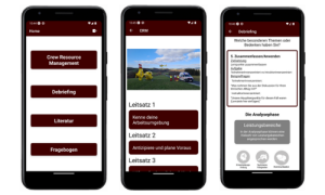
The aim of this thesis was to develop and evaluate an early-stage mobile application prototype that primarily focuses on the presentation of the basic principles of Crew Resource Management and professional Debriefing.
- RQ#1: What errors occured in communication among healthcare professionals during the treatment of critical patients in countries with high quality of care over the past 25 years, and why can errors in communication have momentous consequences?
- RQ#2: What aspects should a mobile application have to improve the working method as well as the processing of individual errors after negative experiences in the everyday working life of paramedics and radiology technologists in Austria?
- RQ#3: What results do the usability test with metrics such as SUS, USE, and NASA-TLX show on an early-stage prototype of a mobile application for Crew Resource Management and professional Debriefing of a usability test with twelve participants?
Background
In the medical field, decisions often must be made in stressful situations, and human errors form a significant portion of preventable mishaps [1,2]. One key to increasing patient safety is the use of guidelines. Crew Resource Management deals with cooperation in teams and associated dynamics, which inevitably rise. With a structured approach errors and their negative outcomes can be reduced.
Methods
To achieve the set goals, a user-centered design approach was chosen:
- Understanding and specifying the context of the problems in the field
- Design of the first mock-ups
- Development of a prototype in Visual Studio Code
- Evaluation by means of a usability test including questionnaires and application testing in real time
Results and Discussion
The literature research shows that lack of information exchange, misinterpretation of information, insufficient documentation, lack of timely communication as well as hierarchy and power dynamics can be highlighted as sources of error. The developed application scored an overall SUS of 87,29, which is categorized as excellent. Further, the results of the USE questionnaire show that the basic features of the application are appealing.
Conclusion
In future steps, the improvement options identified during the usability tests should be implemented. Additional features such as constructive feedback, educational resources, and user feedback on reports. Likewise, the user interface can be revised, which is directly related to satisfaction.
References
[1] P. Carayon, K.E. Wood (2010) [2] M. Rall, et al. (2022)